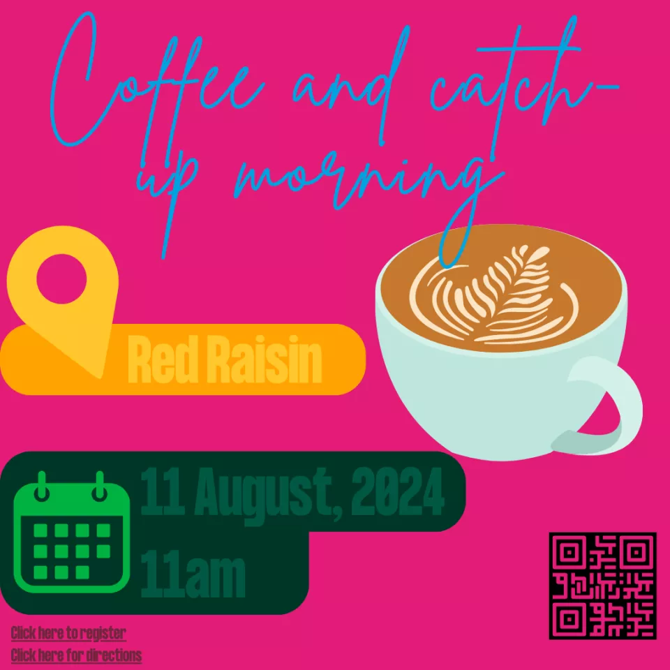
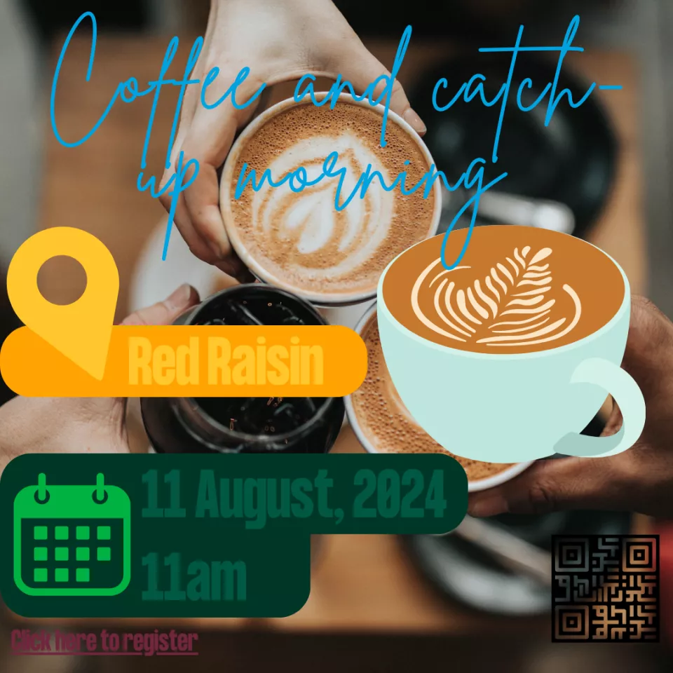
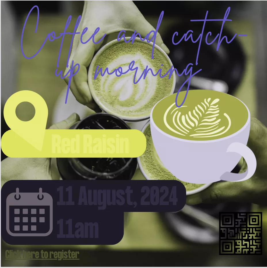
One of the biggest issues with inaccessible images revolves around the usage of images containing text.
They’re usually graphics that were made for social media, screenshots of PDFs and presentation slides, or posters that were intended for print.
When you create and depend on images of text to provide information, you're assuming the end user has the same needs as you.
But these images pose issues for users who may have vision impairments, like colour-blindness, or for those with dyslexia.
Let's run through the issues in detail:
Excluding screen reader users
The biggest issue is that images like this with text in them are non-existent to users of assistive technologies like screen readers.
Screen readers can only read HTML text on a page, not text within an image.
HTML is the text content of your webpages, the kind you can highlight and copy.
Fonts
Firstly, these graphics allow for just about any kind of font. That might seem great, but it isn’t great for users with an additional learning need, a visual impairment or dyslexia.
Funky fonts that you think might look cool can result in someone else not being able to read the information, and nobody deserves to miss out.
How to avoid this issue
The UL website uses a default branded font that is 100% accessible. Graphics containing text should be avoided and instead, full HTML text should be put into webpages/emails/documents.
Colour contrast
Colour contrast is how strongly the colour of the text stands out against the background it’s on.
Even when using UL-branded colours, it's not guaranteed that the colours will be accessible when used together.
Placing text over ‘busy’ backgrounds like photos can also put the colour contrast at risk.
How to fix this issue
Firstly, don't rely on graphics like these to provide information, as unless your image uses very basic colours such as black or very dark text on very light backgrounds, it's very difficult to generate a graphic that won't run into colour contrast issues.
You can use various colour contrast checkers to make sure the text colour is contrasted enough against the background.
We suggest using the Silktide Chrome Plugin, as it has a contrast checker and colour blindness simulators too.
More issues
Links in images
While a link may be clickable and work while you're creating the graphic, they don't work for the end user and lead to a lot of confusion.
Make sure descriptive links are available outside of images for users to interact with.
QR codes
QR codes cause huge usability issues, and should only be used on printed materials.
More information on why QR codes should be avoided.
Correcting errors
Relying on images with text in them to provide information can be really problematic when there’s an error with some of the text.
To solve the issue, you need to edit the image, download it again, re-upload the correct one, remove the wrong one, try and figure out which one is the right one again, and make the swap.
It’s needlessly complicated. If an error is made in simple text on a webpage, you can fix it in seconds and you don’t need to worry about different versions of the same image floating around.
Mobile view
The graphic may look great on your desktop, but how do the vast majority of your site’s users see it? More than likely they’re on their phone, so the image is smaller and more squashed.
They’ll probably have to zoom in to read the information, and when that happens, the image becomes blurrier and blurrier. What if the image file size is too big for that person to see on their mobile network or wifi connection at that moment, and it doesn’t load? That’s poor user experience (UX).
SEO implications
Search engines also really don’t like text with images. In fact, they won’t pick up on any of the information in the image at all. So if all your information on something is in an image, and someone searches for that thing, they’re not going to find it.
Images of text seriously harm your website’s search engine optimisation, or SEO, results. This has a really negative affect on your websites traffic. The more images of text you have on your site, the less search engines like google will show your website to users online.
What to do instead of using graphics
Use plain and simple images of people and places, and keep your text outside of images.
Doing this means you’re using the full capabilities of the website and the end result is high-quality content that users enjoy.
Sure, it might not be as exciting looking. But users don’t really care about aesthetics as much as you think.
If you’re trying to find information online about something that’s important to you, how often do you find yourself marvelling at how visually attractive a webpage is?
Probably not. We’re all busy and just want information that’s simple, straightforward and easy to find.
Creating graphics for social media use only
If you are creating graphics for social media, there’s a few things you can do to make sure your posts are accessible.
Firstly, ensure the text from your graphics are also included in the caption so screen reader users can still receive the information.
Make sure links are clickable in the caption too so your driving traffic back to your website.
Ensure the colour contrast between the text and background is accessible by using an online colour contrast checking tool.
UL-branded fonts are also a surefire way to make sure the text is legible to all users.
Web users ultimately want to get at data quickly and easily.
They don't care as much about attractive sites and pretty design.
Founder of the World Wide Web, Tim Berners Lee