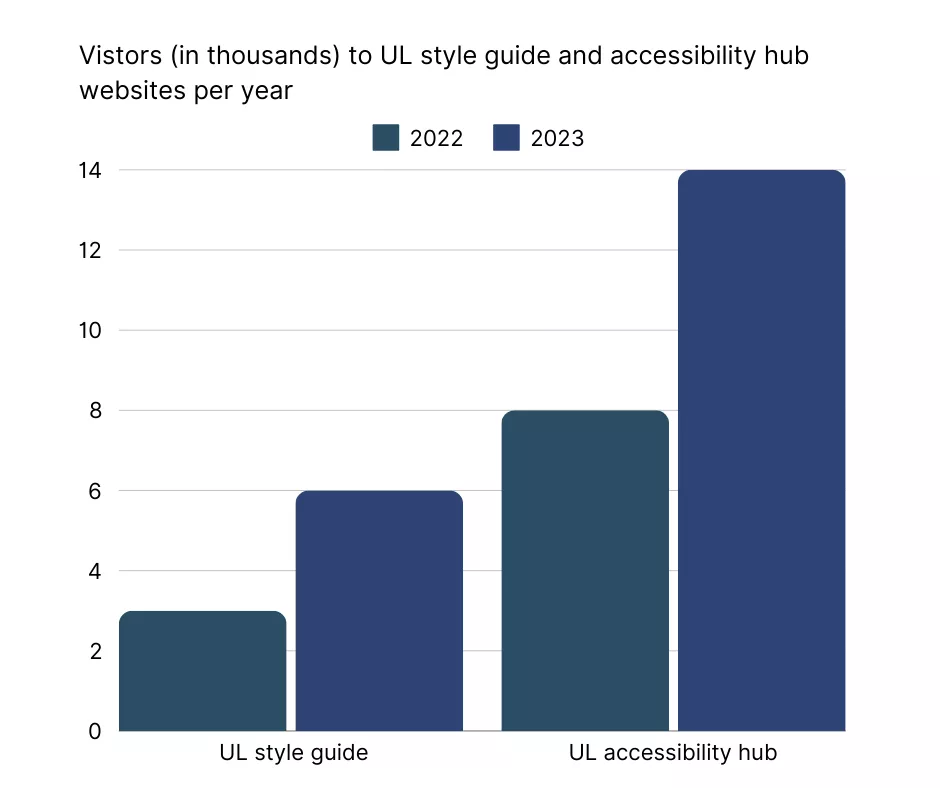
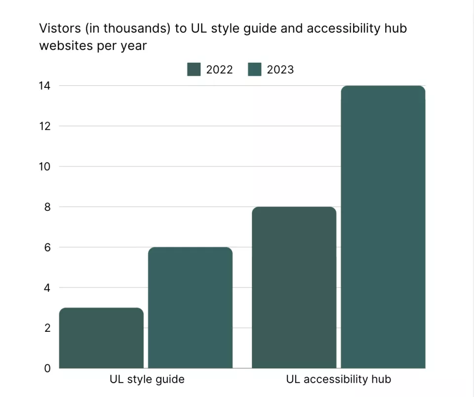
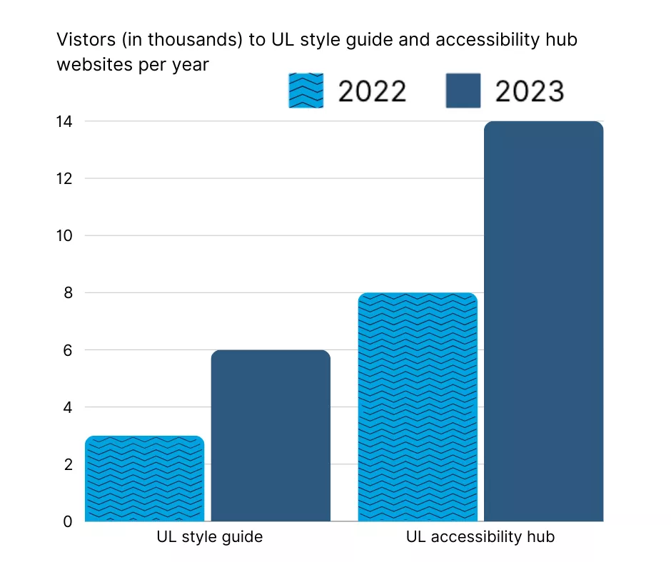
Complex images are those that contain a lot of information, such as infographics that have a lot of text or even data visualisations.
Images of text should be avoided where possible, as they cause many accessibility issues. Full HTML text should be used as often as possible to minimise usability and accessibility issues.
Is the infographic actually needed?
First, consider whether the infographic is actually needed on the webpage. What's the benefit of displaying the information this way, instead of using full HTML text?
High-quality images
It's vital that your image is of high quality and large enough for both desktop and mobile users to read the information clearly.
Text alternatives
If you decide that your infographic is needed, you will need to make sure there are text alternatives for the image also available on the webpage.
Complex images need descriptive text alternatives that convey their content, function, or purpose.
These descriptions are essential for users who rely on screen readers or those who cannot access visuals due to visual or cognitive impairments.
Alternative text for complex images is made up of three parts:
- ALT text: a short description that summarizes and identifies the complex image, graph or chart
- Location of the long description
- Long description: detailed description of the image in text
Alt text
Alt text should summarise the purpose or importance of the image.
A good formula for creating alt text for data visualisations is:
"chart type of type of data where reason for including chart".
For the example shown, an appropriate alt text would be:
"Bar chart of visitors to UL style guide and accessibility hub websites for 2022 and 2023 which shows more visitors in 2023 than 2022"
Location of long description
Next, include the location of the long description.
You can guide users to a long description by either adding a link to it or specifying where it’s located if it’s on the same page.
For convenience, place a link near the image, often directly below it. This link could lead to a detailed description on the same or a different page, helping users access additional information, like a data table for a chart.
An accordion item is also a good choice for long descriptions.
You can also inform users of the location of the long description in the alt text.
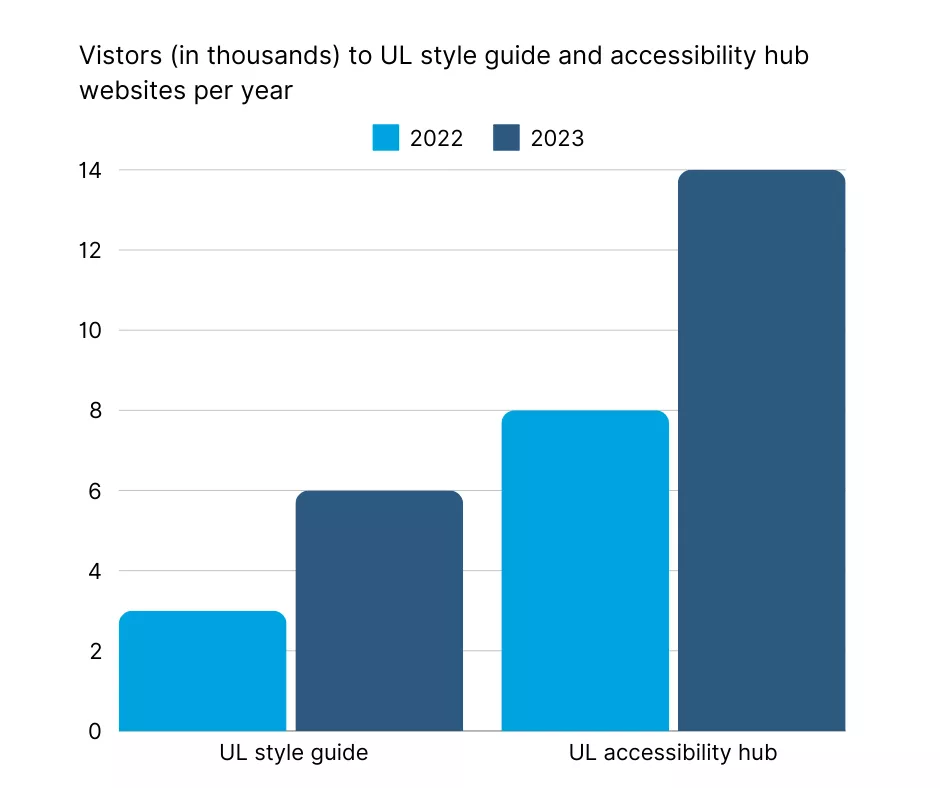
The image is a vertical bar chart depicting the number of visitors, in thousands, to two websites: the UL style guide and the UL accessibility hub, over the years 2022 and 2023.
Each category is represented with two bars: one in light blue for 2022 and one in dark blue for 2023. The “UL style guide” is shown on the left with the 2022 bar reaching 3,000 and the 2023 bar reaching 6,000.
The “UL accessibility hub” is on the right with the 2022 bar at 8,000 and the 2023 bar peaking at 14,000.
The chart includes horizontal grid lines for easier comparison of values. A legend indicates the colour representation for each year.
Writing long descriptions
Long descriptions should be text-based, as using tables can lead to more accessibility and usability issues.
When writing long descriptions, you don't need to describe any visual aspects of the infographic. You just need to relay the information that's key to understanding the main points of the image.
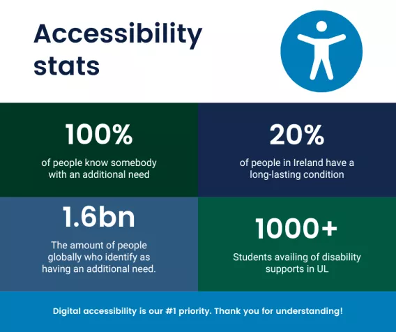
Long description example
Accessibility stats
- 100% of people know somebody with an additional need
- 20% of people in Ireland have a long-lasting condition
- 1.6bn: The amount of people globally who identify as having an additional need
- 1000+ Students availing of disability supports in UL
Digital accessibility is our #1 priority. Thank you for understanding!
Making data visualisations accessible
To make data visualizations accessible, it’s important not to rely solely on color to convey information.
Colour-dependent designs can be challenging for colourblind users, who may struggle to distinguish between similar colours.
Instead, use labels and patterns to differentiate elements within charts and graphs. Adding text labels directly to data points or categories ensures clarity, while patterns or textures offer an additional layer of distinction.
This approach not only supports colourblind users but also improves readability and accessibility for everyone.
