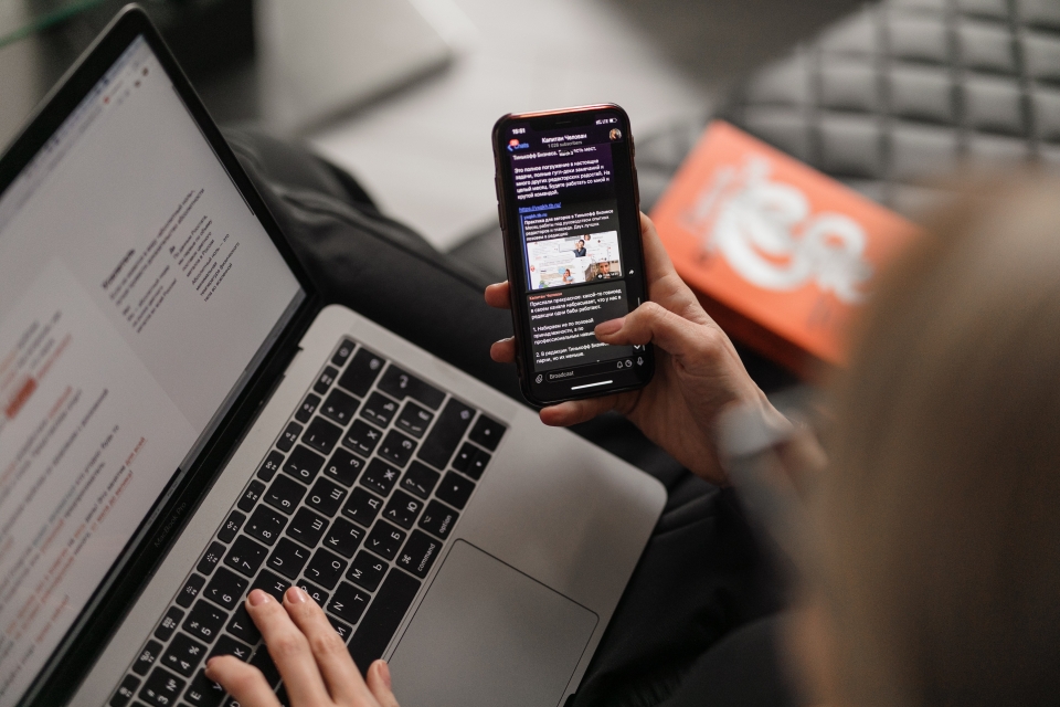
Did you know that 70 per cent of users access the UL website on smart devices such as tablets and phones?
For this reason, we believe it is very important for ul.ie to use responsive web design and for editors to be able to create responsive web content.
What is responsive web design and why use it?
Responsive design ensures that users can read articles, view images, and navigate the website comfortably, no matter what device they are using.
Whether it's a large desktop monitor, an iPad, or a smaller smartphone, when you use responsive design the website will automatically adjust to provide the best possible experience for the user no matter what device they are using.
Creating responsive content for the web
Test your content
The simplest and best thing to do is to test your content. Test each page you create as you are creating it. See testing methods below.
Avoid tables
Tables predate smartphones and while they are still part of HTML, they are simply not responsive especially when used for formatting content. Using tables for simple data still works but not for large blocks of text.
Text in images
Information in images should be accompanied by text underneath or in the body of the page that reiterates the information to the user.
A large image with information may be difficult to see for a user on a smart device. An example would be a step-by-step process explained in an infographic.
This should be accompanied by text explaining it or simply left out.
Avoid PDFs
While they can look great on a desktop or in print, on a smart device they can be hard to read and frustrating for users.
Testing content
There are several online tools and browser extensions specifically designed for testing responsive websites. Some popular ones include:
Google Chrome DevTools
Open Chrome, right-click on your website, select "Inspect," and then click on the device icon in the top-left corner to toggle the responsive view (either smartphone or desktop).
Test on real devices
While testing with online tools is convenient, it's also essential to check your website on real devices. Use smartphones, tablets, laptops, and desktop computers to see how your site behaves across a range of screen sizes and resolutions.
Remember 70 per cent of users access the UL website on a phone or a tablet and just 30 per cent use a desktop computer or laptop, so by creating responsive content, you are creating an enjoyable user experience for everyone.