What is colour contrast?
To meet WCAG AA standards, text must have enough contrast with its background colour to ensure people with moderate vision impairments can read it.
Regular body text
For regular body text (less than 18pt or 14pt bold), the contrast ratio needs to be at least 4.5:1.
Large text
Meanwhile, large text (at least 18pt or 14pt bold) requires a ratio of at least 3:1.
There is a stricter version of this guideline (1.4.6) for WCAG AAA.

Who it affects
Colour contrast in terms of accessibility affects several groups of people, including:
People with visual impairments
Those with conditions like cataracts, glaucoma, or age-related vision loss may find it difficult to distinguish between similar colours, especially if the contrast is too low.
Colourblind individuals
People with colour vision deficiencies (such as red-green or blue-yellow colour blindness) may struggle to perceive differences between colours that seem distinct to others, making contrast essential for readability.
People with low vision
Those with reduced visual acuity (for example, due to partial blindness) often rely on high contrast to see text and graphics clearly.
Older adults
As people age, vision naturally declines. Older adults may need stronger colour contrast to read comfortably, especially on digital screens.
Everyone in poor viewing conditions
High contrast helps people in environments with glare, poor lighting, or low screen brightness, improving readability for all users.
Ensuring adequate colour contrast makes content easier to read and navigate for everyone, not just those with disabilities.
Testing colour contrast
When you run an accessibility check on a document like a PDF, it will often not test colour contrast. This means it will need to be manually done using one of the methods below.
There are a huge amount of online colour contrast checkers that will allow you to see whether the colours you're working with are accessible when used together.
Here are some of our favourites:
- WCAG Color Contrast Checker
- Colour contrast checker for web accessibility - Silktide
- Coolors Colour Contrast checker
- Check contrast between text and background image
Digita11y have rounded up a complete list of colour contrast checkers that are also worth checking out.
Simulators
The free Silktide Chrome Plugin includes an impaired vision simulator and colour blindness simulator.
Impaired vision simulators are great tools for raising awareness among teams about the challenges faced by users with visual impairments.
This fosters a more empathetic and inclusive approach to design.
Whocanuse.com
Whocanuse.com is a tool that shows how color contrast can affect different people with visual impairments.
UL brand colours and accessible combinations
It's important to note that just because two colours are within the UL brand guidelines, it does not mean that they have sufficient colour contrast when used together.
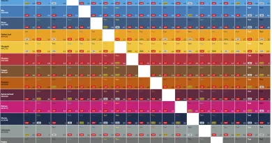
This colour contrast grid of UL brand colours shows what colours are accessible when used in combination with each other.
How to use the grid
AA and AAA indicate that the combination is accessible.
AA18+ means that the combination is accessible when the text is large (at least 18pt font size).
DNP means the combination 'does not pass' and should not be used as it is not accessible.
The following colours can be used as a background for white text of any size:
- UL Green (#005335)
- UL Heritage Green (#003726)
- Stone (#2D5980)
- Munster (#CB333B)
- Copper (#89532F)
- Autumnal Leaf (#6F263D)
- Marine (#13294B)
- Granite (#505759)
- Slate (#373A36)
These colours can be used as a background for large white text (at least 18pt font size) only:
- Sky (#007DBA)
- Salmon (#E31C79)
- Pebble (#707372)
- Shannon (#00A3E0)
The following colours can be used as a background for black text of any size:
- UL Modern Green (#00B140)
- Golden Leaf (#FFA300)
- Marigold (#FFC72C)
These colours can be used as a background for large black text (at least 18pt font size) only:
- Munster (#CB333B)
- Pumpkin (#D45D00)
- Limestone (#919D9D)
- Pebble (#707372)
- Salmon (#E31C79)
Using overlays to increase contrast between text and background images
Images of text should not be used on the UL website or on any of the university's digital channels where full HTML text could be used instead.
However, when text is placed over images when designing printed materials, using an overlay can be an effective way to enhance colour contrast between text and background, ensuring better readability and accessibility.
Apply a semi-transparent colour overlay on top of the background image or pattern. This helps reduce visual distractions while allowing the text to remain clear and prominent.
Choose an overlay colour that contrasts well with both the text and the background image. For example, use a dark overlay (such as black with 50% opacity) behind light-coloured text or a light overlay (such as white with 50% opacity) behind dark-coloured text.
